Reports
As stated in the previous section, Reports are InSkill's easy-to-understand data inventory. Through reports, you can gain insight into your team and their tasks. The following is an example of a Summary Report of machine use in one of our accounts. As you can see, the data is presented in graphs, charts, and tables to give the reader a quick review of the performance of your team over time. The intelligence tab also allows you to narrow your search by product or time whether it be 1 week, 2 weeks, 30 days, 90 days, 1 year, or all time. Please keep in mind that the more you use InSkill the more insight can be provided through reports.
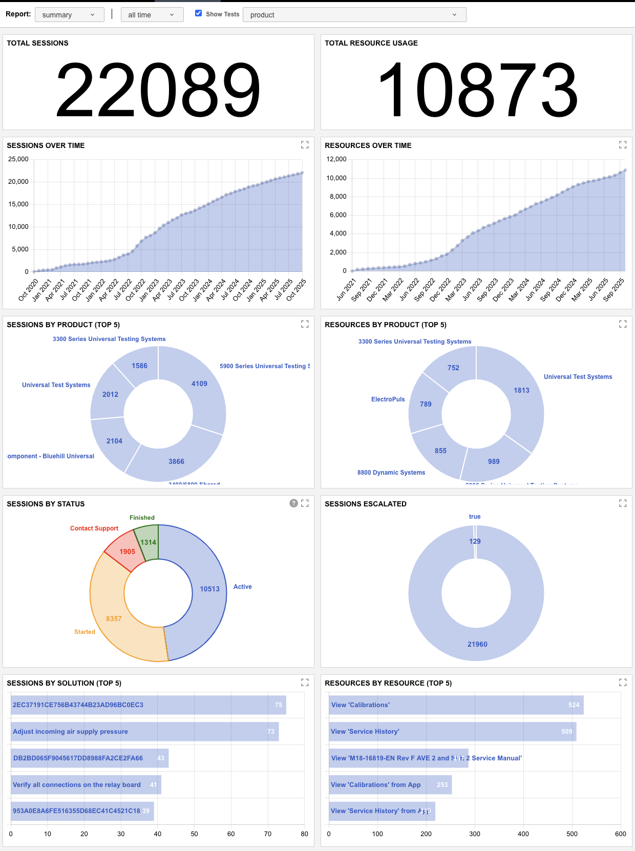
This section provides insights into how users engage with tasks and resources across the platform. It includes metrics such as the total number of task sessions completed, the time period in which they occurred, and their overall effectiveness. In addition to task performance, this section tracks resource utilization with detailed breakdowns by product and time range, offering a comprehensive view of platform usage and user behavior.
The chart below breaks down the specific types of reports included in the summary above, providing additional clarity on the data presented.
| Report Type | Description |
|---|---|
| Total Sessions | Displays the total number of task sessions initiated within the platform. |
| Total Resource Usage | Shows the total number of times resources have been accessed. |
| Sessions Over Time | A trend graph showing how many task sessions have been initiated over time, with a cumulative view of session growth. |
| Resources Over Time | A trend graph illustrating how many resources have been accessed over time, with a cumulative total up to each point. |
| Sessions by Product | Pie chart breaking down task sessions by product copilot, highlighting the top five copilots used. |
| Resources by Product | Pie chart showing resource usage distributed across product copilots, highlighting the top five copilots associated with resource views. |
| Sessions by Status | Color-coded pie chart displaying the status of task sessions, indicating how many were completed, initiated, active or escalated for further support. |
| Sessions Escalated | Pie chart showing how many sessions required escalation to support, representing overall task resolution effectiveness. (True = Escalated | False = Completed Task) |
| Sessions by Solution | Bar chart indicating which solutions successfully resolved sessions, based on the “Finished” outcome selection at the end of a task. |
| Resources by Resource | Identifies the most frequently accessed individual resources within your account. |
Updated 2 months ago